

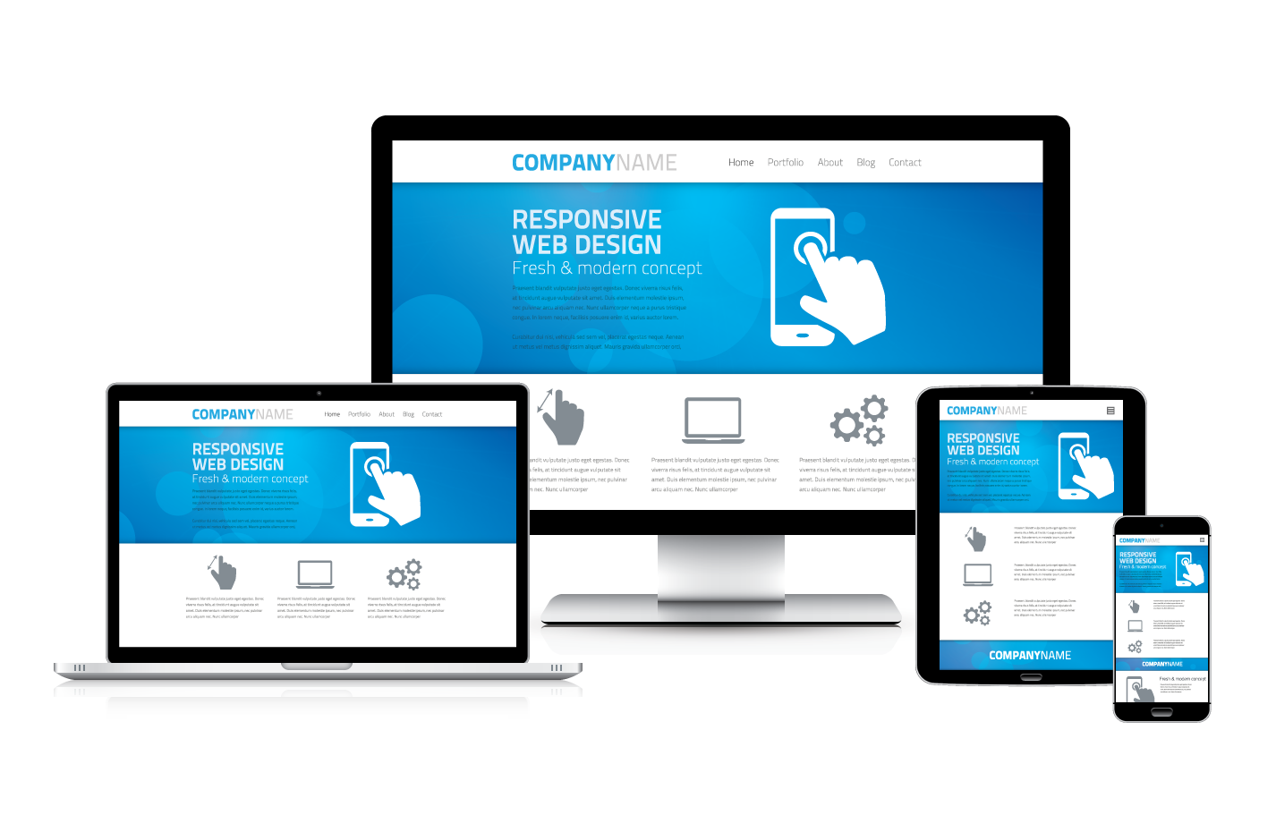
A lot of my clients ask me if they need to make two websites, one for desktop and one for mobile. Luckily, all of the websites I create work for any screen size from large TV’s to small mobile phones. This is what’s called responsive web design. Mobile websites are must haves in today’s world. See why this is below.
Why your website should be mobile friendly:
As per the latest statistics, majority of the internet users (approximately 55%) use mobile devices to access internet. Predictions claim that this figure will easily reach 65% mark by 2017. People, who access internet via their mobile devices such as smartphones and tablets, thoroughly expect characteristics like user-friendliness, speed and simplicity from websites. That being said, your business will fail to address more than 55% of internet users if your website is not optimized for mobile devices (no matter how informative or useful it is). In simplest terms, making your website mobile-friendly has become an obligatory fact.
Reasons to make your website mobile-friendly
- Having a mobile friendly website is becoming a norm
Yes, having a mobile friendly website is becoming a standard for any business. Therefore, if you need to stay alive in the huge competition out there in the market, your business must have a mobile friendly website.
- Google prefer mobile friendly websites
Search engines like Google continue to increase the efficiency of their algorithms. As per the latest algorithms, your website will be given preference over non-mobile-friendly websites by search engines. This is a great advantage in terms of search engine optimization (SEO).
- Mobile friendly websites are futuristic
Websites that are mobile friendly has futuristic appearance and functionality. In fact, your website becomes virtually useless if it has outdated appearance, inconvenient navigation and poor functionality no matter how rich its contents are.
- Mobile device users are decision makers
Unlike most of the PC users, mobile device users are much likely to perform purchases based on the results they find via internet. Therefore, optimizing your website for mobile devices makes a direct impact on your business’s revenue generation. When decisive information of a business like the location, open hours, contact information etc. is easily acquirable via mobile devices, it is an encouragement for your visitors to have confidence about your business. You can be creative and add more convenience to the website appropriately.
How to make your website mobile friendly?
Knowing the importance of being mobile-friendly, it is important to do the necessary tweak to your website. Adjusting the sizes of the images, changing the input types and avoiding fixed positioning are among the best practices when going mobile. Selecting font styles wisely, smart usage of mobile plug-ins and selecting the appropriate color schemes are vital. However, there are various other facts to consider when optimizing your website into a mobile friendly one.
Transforming your website into a mobile-friendly one is not the easiest task if you don’t have thorough knowledge about the latest web technologies. Therefore, the wisest decision is to hire a professional web designer to make the necessary tweaks on your website.
Benjamin Cohen Creative will thoroughly inspect your existing website and identify the areas that need rectifying. Our experts will then upgrade it to a completely mobile-friendly website assuring the optimum results. Contact myself now to get the rates of our affordable packages and obtain more information!